Saturday, May 28, 2011

Happy NOTD: OPI skull and glossbones

Why so happy? Because I've finally, after searching for over a year, found the perfect grey creme nail polish!
If you have seen my other NOTD posts you might have noticed me ranting about grey polishes always turning blue, purple or corpse toned on me.
I have laid to rest my search.

Skull and glossbones is from OPI's new pirates of the Caribbean collection. I picked up 3 other colors too (including silver shatter) because I really these odd dirty colors ;)

Skull and glossbones is a perfect mix of white grey and beige. No ugly green, purple blue or yellow undertones to be seen. It's a true ghostly grey.

For my pale friends I have to say that you need to check out the OPI pirates collection. Most of the colors look smashing against pale skin tones!

Tuesday, May 24, 2011

Kat Von D metal orchestra palette photos and EOTD

I hope everyone had a great long weekend! I didn't do very much, just spent some quality time with family.

I used this palette today, to do a smoky blue eyed look.
If you are familiar with the looks I do, you already know I don't use blue eyeshadow.. like ever.
In fact, this is probably the only real blue EOTD you will ever see on my blog.
I read a few reviews saying that metal orchestra had the most 'wearable' blue colors, and after seeing other people's EOTD's they did with this I thought I may as well try it!

The Colors in this palette with my own descriptions:

- First Class (white with glitter)
- Techno (light blue with glitter)
- Thrasher (deeper medium blue with shimmer)
- Dagger ( Dark navy blue with glitter)
- Lucifer (matte black, this color is found in almost all KVD palettes!)
- Glock (gunmetal silver shimmer, also in KVD adora palette)
- Razor Gray (medium grayed silver)
- Slayer cream shadow (shiny metallic silver, also found in KVD adora palette)

And here is my EOTD using the blue shadows:


This is another EOTD I did with metal orchestra, using the silver and greys:


I can't believe how much I actually like this palette. I avoid blue shadow like the plague but the way the colors are coordinated in metal orchestra makes the blues easy to use, and surprisingly edgy looking.
I think that metal orchestra is similar to the adora love and fury palette in that all the colors are deep and dramatic, and really make a statement. Not for those who only wear neutrals that's for sure!

Once again I am impressed with the packaging, quality and pigment of this palette. I have yet to find a Kat Von D palette that I don't like!

What do you think of blue eyeshadow? would you wear it?

Wednesday, May 18, 2011

Urban Decay jailbait lipstick photos and swatches

Urban Decay lipsticks rock my socks. I love them. I've read a lot of bad stuff about the scent/taste but I don't have a problem with it at all. I find they smell like burnt sugar, sort of sweet.
Jailbait is a very warm nude color. It has a slight orange peach undertone to it. It's very pretty but if you are cool toned it might look slightly too warm.

Wearing jailbait:


I definitely think that these lipsticks are worth the $22. They are nicely pigmented, not drying, somewhat hydrating and they last a while on the lips.
I adore the tube design as well, the knife -although kind of odd to be on a lipstick container- is sort of unique and daring.

Have you tried Urban Decay lipstick? What's your favorite color? I really want to get oil slick myself.

Tuesday, May 17, 2011

Stylish blogger award!


I was given this award a few weeks back by the lovely from fierce nerditude. Thanks so much to you, lovely lady!
I don't know if I would consider myself really 'stylish', I more or less just wear black t shirts and jeans every day; and I do my makeup whatever way I feel like doing it :)
I guess I do have more of an 'alternative' look, but I like to keep it pretty toned down now that I'm getting older.

here are 7 random facts about me:

1. If you are wondering how on earth I came up with the name for my blog 'makeup or morte' ...well here it is. It translates to 'makeup or die'.
A few years ago I had some very horrible things happen. I was sicker than I've ever been in my life. I could barely leave the house for months. I was weak and I felt like I was dying. And throughout this time, I kept telling myself that if I'm going to die anyways I may as well die looking pretty. Even though I could barely stand up, I would force myself to put some makeup on. I couldn't even leave the house but I did it just to feel good about myself in that little way.
So when I thought about a name for my blog, makeup or morte came to me naturally ;)

2. I love dance music, it always puts me in a good mood.

3. I am an awesome cook. I like making gourmet meals and my specialty is Chinese food.

4. I write a lot. I have a lot of journals I've kept them since I was 6. Somewhere around 20 of them. Maybe more. A few have gone missing through the years :( I wish I could get them back.

5. I am certified in cosmetology but I chose not to work in a salon or as a makeup artist because I can't stand touching people.

6. Ok so I was quite the goth from age 15 into my early 20's. I used to wear so much black eyeliner you couldn't tell what color my eyes were- LOL

here is a pic for reference:


7. I can't think of anything else at the moment. If you are curious of anything just ask me!

Also wanted to mention I've extended my giveaway closing date. It's now open until June 1! Now there is more time for everyone to enter :)

Sunday, May 15, 2011

MAC truth and light magically cool liquid powder review

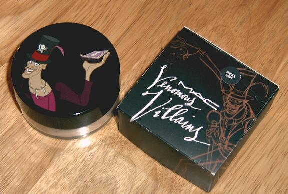
I got the original release of truth and light magically cool liquid powder from MAC's venomous villains collection back in October. I figured I'd wait and do a review when the product became part of MAC's permanent line, which it now is! There are other colors available as well, including:
  • honey rose (Sheer rosy beige with multidimensional shimmer)
  • cajun (Sheer bronze shimmer with reflects gold)
Truth and light is described as 'Sheer shimmer with reflects of silver and pink'. I personally don't see much reflects silver or pink, it seems it's so translucent that it goes on pretty clear with very slight gold shimmer. That is just the way it looks on me.

Swatches of truth and light (layered heavily to capture the color) :


The powder itself is interesting, it's extremely sheer and light. It feels wet when first applied, then dries onto your skin leaving a nice 'soft focus' effect that diffuses light.

I will start by telling you I have very dry skin. This powder feels great when I first apply it, but after it sets my skin feels a lot drier than before I used it.
I realized that the water content in this powder evaporates off your skin after the product sets, and it takes the moisture right out of your skin.
I don't like it because it made my skin feel uncomfortably dry after a couple uses. It did, however, keep my makeup looking fresh all day. This would be most useful for those with normal to oily skin.

To give you an example of how this powder looks, here is a comparison photo of me without foundation, and one beside it with only truth and light powder on:

I just realized the photos are labeled wrong. oops.
On the left my skin is slightly shiny from moisturizer, and on the right the powder itself covered a little bit of redness and added a very nice even toned finish to my skin. It did not cover my acne scars on my chin. It's quite sheer.

Now, here is a comparison of how the powder looks over foundation. On the left I'm wearing L'oreal true match foundation only. On the right, I added truth and light over top. Both photos were taken in the exact same lighting. AGAIN the photos are labeled wrong. sorry!

You can see how this powder really sets the foundation, and adds a very matte finish. It's matte but very soft looking, and really does blur any imperfections or lines. If you notice, you can see it took the 'shine' from my skin, the flash did not reflect off my face in the 2nd pic at all. Well, that shine was more or less moisturizer, and the powder evaporated the moisture right out of it.

Overall, this is a great setting powder if you like the matte look. Also, if you have any fine lines this powder is great to diffuse them. I would stay away from this if you have dry skin, because your skin might start to look a little dehydrated with continued use.
I also forgot to add this does not make a good highlighter for pale skin, it barely shows up unless you really layer it on. It could be used as a highlight on medium dark skin tones, then it would show up more.

Repurchase? No, this is not right for me.

Price: $35.50 CAD

Rating: 4/5

Saturday, May 14, 2011

Giveaway reminder!


Hey everyone, I just wanted to remind you all to enter my giveaway! there are plenty of prizes to be won, and it's open internationally.

There are only two days left, so if you haven't already, go here and enter :) EDIT: I have decided to keep this giveaway open until June 1!

Tuesday, May 10, 2011

The body shop big and curvy mascara review

I started a new job Monday so if I'm not posting as often in the next while it's because I'm exhausted! I'm so dead tired but I wanted to do this review for everyone.

A while ago I had some store credit at the body shop (since their vitamin E illuminating moisture cream burned my skin!) and, I picked this mascara up because it was really cute looking pink and black tube. Lesson #1 never let cute packaging be the sole reason for your purchase!

The Claim:

' Big and curvy mascara makes lashes appear up to nine times thicker and noticeably curvier. A unique smudge, flake and smear resistant formula holds lashes in place for a curve that lasts '.

Sounds too good to be true doesn't it? Let me tell you, it is!

The brush :

The brush is thin and long, and shaped sort of like a cone. The bristles are tiny and they hold a lot of product, so I had excess product building up each time I used it. Eventually, after maybe the 5th use the brush was so loaded with the sticky formula it came out of the tube like a big black gooey blob. Not cool.

This mascara went on my lashes nicely, but I found it didn't add very much volume or length in one coat. I needed two coats to get some decent volume. And then this happened:

with 2 coats big and curvy mascara:

It clumped up in patches, because the brush held on to bits of the sticky formula in different areas. I'm sure that if I wiped off the excess mascara from the wand before applying I would not have as much clumping, but then I'd be wasting the product.
This is not only where this mascara fell short.
At first the mascara goes on sticky and wet, and dries to a slightly crunchy feeling mess. This resulted in MAJOR flaking. I don't usually have issues with mascaras falling in bits and pieces all down my face, but with this I ended up wearing more on my face than on my lashes.

There is no way to justify paying over $20 for such a disappointing product.
One thing it did happen to do was keep my lashes up, somewhat curved. I attribute this to the formula, which hardens as it dries so that your lashes stay in place.
However, I would not recommend this mascara to anyone, ever. There are much better mascaras out there for even 1/4 of the price!

lesson #2 just because something is expensive doesn't mean it's any better than something lower end.
Example: I have recently been using a mascara from Asia that costs $1.50 CAD and it's one of the best I have ever used. Review to follow, but it is called 'chaarming-cat waterproof mascara'.

Repurchase? No. never.

Price: $21 CAD

Rating: 1/5

I just realized this is the lowest rating I've ever given a mascara on my blog!

Wet n Wild silent treatment trio photos, swatches and EOTD

I sort of had high expectations of this trio, since everyone is always raving about how great the new Wet n Wild eyeshadows are.

top to bottom: brow bone color, crease color, lid color

They have decent pigment, and the color payoff is pretty good over an eyeshadow primer.
I did find the brow bone and crease shades a bit chalky. The brow bone color is especially hard to work with, I practically had to dig at it to get it to show up.

Swatches top to bottom: lid, crease, brow (you can barely see it!)

My favorite is the smooth textured lid color (top), it's the winner of the trio!
EOTD using all 3 colors:


This trio is ok, but nothing amazing. I really like the lid color and I would buy it separately because I'm not going to use the crease and brow bone colors much.
I find some of Wet n wild products great, while others are sort of mediocre. The best thing about the brand is that it's easy on the wallet!

I suppose I am used to using more expensive buttery pigmented eyeshadows all the time, so I wasn't wowed by this at all. I can see how some would think it's great.
Do you like Wet n Wild products? Whats your favorite?

Saturday, May 7, 2011

Kat Von D celebutard lipstick photos and swatches

Kat Von D lipsticks are really nice. The colors are pigmented and they are not at all dry feeling on the lips. They last a decent amount of time through the day too.

Celebutard is a light peach pink nude. It's got enough peach in it so that it doesn't make my face look washed out. I reach for this when I do a dark smokey eye.
The finish is matte, and it can exaggerate dry lips so I'd recommend wearing a balm underneath.

Swatches of celebutard:


My lips are really dry and chapped lately so please excuse the ugly lip swatches!


Do I think the $20 price tag is worth it? Yes. I do wish these lipsticks had a vanilla scent or something like MAC, they are fragrance free as far as I can tell.
I adore creamy textured lipsticks, so these are an instant favorite. Of course the pretty packaging is an added bonus too.
Next I want to get lovecraft! Such a great name.

Have you tried any Kat Von D lipsticks? There aren't too many online swatches so I would love some recommendations.

Friday, May 6, 2011

Trash review: MAC bare study paint pot

The most recent product I've completely used up is MAC paint pot in bare study. This is the second one I've gone through. Time to 'back 2 MAC' it!

I used it every day give or take for almost a year before hitting the glass bottom. I never had any issues with it drying out, I always keep the lid on tight and store it upside down.
Paint pots are a really nice cream eyeshadow product, they don't crease and they last all day. Bare study is a shimmery champagne color. I use it as an eyeshadow base or as an all over lid color wash when I'm in a rush.

Bare Study paint pot swatch:

I like how the shimmer is very fine and not too sparkly. It works well with other shimmery eyeshadows.

Here is bare study on my eye with nothing else:


Paint pots are one of my favorite eyeshadow products. I also use them in the colors painterly and rubenesque all the time. They are great to use alone or under powder eyeshadow. Considering it will last a year or so, it's great value! I can't think of anything bad or disappointing about this product.

Repurchase? Absolutely.

Price: $20 CAD

Rating: 5/5

Wednesday, May 4, 2011

Clinique fresh bloom all over color swatches


I don't use very much makeup from Clinique, but one of the cutest things they sell are the fresh bloom all over color palettes. They are shaped as a flower and contain two colors, one light and one a little deeper.
They can be used to add some shimmer on eyes, and highlight or blush on cheeks.

There are a few colors available, I have almond blossom and posy.
I used to have peony too but I didn't like it as much. It's a light beige with a pink flower. It was too dark to highlight with and too light to use as a blush.

Posy :

Mine broke in transit, in case you were wondering what happened. Even though it broke I repressed it and I am still able to use it as a blush.

Posy is a shimmery mauve pink brown color.

wearing posy on my cheeks:

Almond blossom:


Almond blossom is a warm shimmery bronze brown

Wearing almond blossom on my cheeks:

These function the same way MAC mineralize skin finishes do. Of course they look a little prettier, with the flower pattern. They are also a lot less glittery than MSF's.
They aren't a must have product, but nice to have if you like shimmery highlighting powders.
They are a bit expensive at $38.50 CAD but I guess pretty designs/packaging always seem to cost more!