I just wanted to write a quick post to say hello! I am so sad my computer is RIP and I'm going through blogger withdrawal!
On a more positive note I will be posting a giveaway for all of my readers April 15, which is the one year anniversary of makeup or morte! I'm very excited about this and I just can't wait.
I am going to have 3 sets of prizes, so there will be 3 winners!
It's my way to say thanks to all of you for your support :)
Hopefully I will be back with a working computer much sooner than that, but if I am not you can absolutely count on me posting on ~April 15~!
~Lexa

Make up swatches, pictures, reviews and more from an obsessive compulsive cosmetics junkie.
Saturday, March 26, 2011
Saturday, March 19, 2011
Hard candy fire alarm lipstick photos and swatches
 I am so sad to say that my computer died today. I was only able to do this post because I had it saved in my blogger drafts. I'm afraid that I might not be able to blog for a while :(
I got Hard Candy fire alarm lipstick because I was looking for a peachy color for spring. Not to mention I was drawn to it's cute cherries and sparrows on the tube too.
I love how each tube has different designs!
 It turns out that fire alarm is a lot lighter than I thought. It's super pale nude.
 It does have a slick, almost glossy finish - but it mangaged to get into every single lip line that was possible. I did not like it very much.

The color isn'd bad, I like nudes. It's a fairly neutral mix of peach and pink. It reminds me a lot of MAC creme de nude, it's probobly very close in color.
The finish is just not very nice. I find that there is a cheap feeling to it, and I don't think I'll be buying any more of these.
I did buy the new Hard Candy glossaholic lipgloss in rise & shine today, and I am totally in love! It's got caffiene in it, and it smells awesome. Like a mochacchino with a dash of mint. It even has rainbow flakie sparkles that are so pretty to look at. I will do a post on it as soon as I can.
Friday, March 18, 2011
Clarins Cotton Flower face palette photos and swatches
 Clarins cotton flower palette was released for spring 2010. I found this little beauty recently at Winners, which is a Canadian partner of TJ Maxx. They often get Clarins items in, lot's of limited edition products and even some of the permanent line. It's a great way to try out Clarins without spending a fortune.
 The palette is so pretty to look at, adorned with white shimmery cotton flowers. The powder itself is flesh toned, with very fine shimmer. Mixed together they create a very natural looking beige highlight. It almost blends in with my skin, but it's got a very slight peachy tone to it.
Swatches :

 Here I am wearing it on my cheekbone, even though I put a lot on it is still a very minimal 'glow' effect.
This is a great option for more mature ladies that just want a touch of luminescence. Personally I like a little more shimmer in my highlighters.
It also works alright an all over face powder, but on my skin it looked a bit too warm. I love face powders with a little shimmer in them. I can't find any good ones now that my favorite sally hansen corn silk illuminating powder (HG for 4 years!) has been discontinued :/
Do you like illuminating powders? What is your favorite kind?
Thursday, March 17, 2011
MAC chilled on ice paint pot photos and swatches
 I got another paint pot from MAC's cham pale collection, chilled on ice. It was a while ago actually. Anyways, I wanted to share it's glittery goodness with you since a lot of online swatches make it look shimmery - which is what I thought it would be; But it's chock-full of glitter!
 It's got a really neat cool silvery undertone to it and it just looks awesome in different lights. The only thing is that you *really* need to layer it on in order to see that effect.
 2 layers:
 3 layers:
 4 layers: you can really see the cool undertone here, and the glitter!
 This is what 3 layers looks like on my eye:
 This paint pot disappoints me with it's sheerness. It is gorgeous, yet the glitter just gets everywhere and the fall out through the day is annoying.
This works really well under gold eyeshadow, it makes it a whole lot more dimensional. Of course it will add super sparkliness to your eyeshadow as well.
You can see my swatches of dangerous cuvee paint pot here, it was also released with MAC's cham pale collection. It is also sheer and glittery.
I wish these paint pots didn't have soo much glitter. Nevertheless, they are very pretty to look at.
Tuesday, March 15, 2011
NOTD: ombre mani using color club front row diva
 I've often wondered how to do a nice gradient nail, and discovered most do it using a sponge. I got inspired by a photo recently, and thought I'd take a go at an ombre mani!
 This was my very first attempt to gradient colors.
I first did 3 coats of color club front row diva, which is a pale greyed pearl with a little bit of sheen. I then used a wedge sponge and added on 2 coats of Essence surf break, which is a medium grey cream. I concentrated the color at the tips, and dabbed it down lightly to the middle of my nails.
Then I took a Sally Hansen Xtreme wear glitter (sorry I forgot the name!) and did 3 coats, again concentrating at the tips and dabbing it downwards.
I liked the effect but I know it's nowhere near perfect.
left to right: color club front row diva, essence surf break and sally hansen Xtreme wear glitter


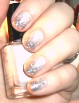 This was really fun to do and I think I'll try again when I have more time to make a nice smooth color degrade.
Monday, March 14, 2011
Maybelline dream smooth mousse foundation review
 I recently ran out of my usual foundation, L'oreal true match in shade N1. I felt like trying something new and I saw the Maybelline dream mousse foundations were on sale for $8.47 CAD, which is dirt cheap considering most drugstore foundations are $15 and up here.
 The packaging is alright. The compact opens to reveal the sponge, and then you twist the bottom to get to the foundation.
 Color matching:
Hey Maybelline, guess what? not all pale girls have pink undertones!!!
I've tried a few other Maybelline foundations (dream liquid mousse, dream matte mousse) and all of them including this were too dark and pink toned for my neutral skin.
Dream smooth did blend very nicely into my skin, but up close and in natural light you can tell this does not completely match. It's a shade or so too deep, and the tone is warm pink. This is the usual for drugstore foundations, with the exception of L'oreal true match.
Coverage:
I found this to be light to medium in coverage. I used two layers to get my skin completely even looking and smooth. It covered redness, scars and any small blemishes. I was quite happy with the result, my skin looked flawless.
Wear:
This stuff stayed put all day. About 8 hours. Then it would get a little greasy looking and start wearing off slowly. Not too bad considering I didn't use any powder or primer with it.
Before and after :
 Overall, I liked this foundation even though the color was a little off. After 3 days of wearing it I started developing small bumps on my t-zone, and realized that this was clogging my pores. I had the exact same problem with dream liquid mousse, and it's happened with many other foundations as well.
This is definitely not for me. It would be excellent for someone with dry resistant skin, that does not break out or react to skin products easily.
Repurchase? No
Price: $11.99 CAD
Rating: 3/5
Saturday, March 12, 2011
MAC mascara X review
 MAC mascara X has been on my 'to try' list for a long time, years even. I just never picked it up because every time I go to MAC I'm too busy looking at all the new limited edition collections!
 MAC's decription:
'Creamy formula builds glossy, natural-looking volume. Quickly coats lashes from root to tip. Keeps them light and flexible. The soft fibres of the football-shaped brush deliver maximum payoff. No smudging.'
Everything described is totally accurate about Macara X. 'Maximum payoff' is a pretty loose term, if you are expecting something dramatic you won't find it with this.
The football shaped brush:
 Wearing 3 coats of mascara X:
 This mascara delivers a little length, a little volume and some definition. It goes on very thin, but it is buildable. It really needs two coats or more for any amount of impact. It doesn't clump easily when adding layers, which is great. The formula is good, it doesn't flake or smudge.
It has a slight rose scent, it doesn't bother me because it isn't strong.
Overall, it's decent if you want your lashes to look natural, but for someone who wants drama this is not the mascara to pick.
For the price, I do not think this mascara is all that. The results are comparable to Maybelline great lash, just a little bit of length and volume, and nothing more.
Repurchase? No
Price: $17 CAD
Rating: 3/5
Wednesday, March 9, 2011
Hard Candy honeymoon blush photos, swatches and FOTD
 I bought this thinking it would make a really pretty highlighter, but surprise! It shows up as a blush on my pale face. Another winner from Hard Candy!
 Honeymoon has multiple colors swirled through it, including peach, gold and light lavender. The color turns out to be a really gorgeous glowing pinkish peach.
 It has an awesome iridescent quality to it.
 It's such a nice face-brightening color for spring! Of course medium and dark skin tones could use it as a highlighter since it wouldn't show much as a blush.
 FOTD breakdown:
face:
- Revlon colorstay in ivory
eyes:
- MAC bare study paint pot
- MAC family silver eyeshadow
- urban decay 24/7 liner zero
cheeks:
- Hard Candy honeymoon blush
lips:
- MAC english accents lipglass
Monday, March 7, 2011
Lancome rose ballerine natural origin eyeliner photos, swatches and EOTD
 Lancome came out with two new LE CRAYON KHÔL pencils for the Ultra Lavande collection spring 2011. The two colors are Ultra lavande which is a bright mid toned lavender and pink ballerine which is a light whitish baby pink.
I picked up pink ballerine because it was pretty, and I haven't seen an eyeliner this color before.
I planned to use it to brighten up my lower waterline, as I find using a stark white pencil looks horrible on me.
 These two new khol pencils are 'Formulated with 94% natural-origin materials'. Sounds good to me! I found that the texture was very smooth and the color was very pigmented.
Swatch:
 This pencil brightens up my eyes wonderfully! I was really impressed, it stayed for most of the day on my waterline.
Before (nothing on my waterline):
 With rose ballerine on my waterline:
 It adds the perfect amount of color to take away any redness and make my eyes look more awake and vibrant. It didn't burn or irritate at all.
I'm sure there are many uses for this pencil as well, but it works perfectly as an eye brightener.
I definitely think that these pencils are overpriced at $24.50, but they are of excellent quality. I also think that using more 'natural' ingredients near my eyes is a good thing.
What did you think of Lancome's Ultra Lavande collection? Did you get anything?
Sunday, March 6, 2011
NARS gipsy lipstick photos and swatches
 I have a hard time finding flattering red lipsticks. I think that any skin tone can wear red, but they need to choose the right shade. Finding one that suits paler than pale skin is not easy.
NARS gipsy is quite a nice red toned color that isn't overly brown blue or orange. It's pretty neutral. It is not overpowering or bright, but rather somewhat sheer. It can be built up to a brighter red, or sheered out to a light red stain.
I think it would suit any skintone.


 It just adds a subtle reddish tint to my lips. It's quite pretty and lady-like.
Whats your favorite red lipstick?
Saturday, March 5, 2011
Kat Von D tattoo chronicles volume 1 photos, swatches and 3 EOTD's
 I've been meaning to post this but I just haven't had time, I am absolutely in love with this palette!
 The tattoo chronicles is packaged to look like a worn and slightly tattered vintage book. Sort of like an encyclopedia. Inside you will find 3 pages of Kat Von D's drawings and writings :
Page 1:
 Page 2:
 Page 3:
 After the 3 pages of writing and drawings, you will find a mirror and the eyeshadow palette. Included are 12 eyeshadows, 3 eyeshadow primers, and a pair of false lashes.
 The palette then pulls out revealing another of Kat's drawings and a double ended roller ball with saint and sinner perfumes.
Saint smells sweet and fresh, Sinner smells musky and slightly spicy. Sinner actually really reminds me of Tom Ford's Black Orchid, the dry down notes are very similar.
 The palette removed from the book:
 The eyeshadow primers: L to R skin, stellar, smoky
 Swatches:
skin, stellar, smoky
 These primers are pretty sweet. They perform well, no creasing or fading at all. I love the little stars on the tubes!
- Skin is a yellow toned beige, perfect for doing neutral looks
- Stellar is a light pinkish white with shimmer, it really brightens up the eye area
- Smoky is a dirty grey color, not really 'pretty' on it's own but it works very well under dark colors making them much more dramatic
The eyeshadows:
L to R Tijuana, taxidermy, hollywood, peanut


 - Tijuana is a rich blackened brown with flecks of copper
- Taxidermy is a warm shimmery bronze
- Hollywood is a rich golden amber
- Peanut is a shimmery beige champagne
L to R : Redemption, Soltitude, heartkiller, bandelaire


 - Redemption is a vibrant blue creamy matte
- Soltitude is a shimmery lilac
- heartkiller is a baby pink with silver sparkle
- bandelaire is shimmery silver
L to R: Monastary, poe blue, nite owl, lemmy


 - Monastary is a charcoal black with silver glitter
- poe blue is a gorgeous dimensional deep blue
- nite owl is a rich deep forest green
- lemmy is a surprisingly wearable light lemon
I have to say that I was not expecting much from these eyeshadows. I was literally shocked when I first used them, they are so pigmented that I barely had to pick up any color on my brush. They are more finely milled and pigmented than most shadows from MAC or NARS. I'm very impressed with their superb quality!
The range of colors was interesting to work with, even intimidating at first, but I ended up loving them all.
Here are my EOTD's using each row of colors:


 I used skin primer, Tijuana, taxidermy, hollywood and peanut eyeshadows. I absolutely love this look. It's perfect when I want to do a neutral eye with a kick. The colors work wonderfully together.

 I used stellar primer, Redemption, Soltitude, heartkiller and bandelaire eyeshadows. I really wasn't feeling these shadows, they just aren't my colors. They did grow on me and I got the most compliments wearing this look!

 I used skin primer, Monastary, poe blue, nite owl and lemmy eyeshadows. These are my absolute favorites out of the palette. I can't even explain how nice and velevety the texture of these are. They just blend really smooth and look great. I use these colors the most.
After trying this palette I decided I'm converting to Kat Von D makeup. I've recently purchased Ludwig and Beethoven palettes and the quality is consistent. I wish I lived near Sephora so I would have gotten into these lovely palettes earlier.
I highly recommend this palette, it's absolutely worth every penny.
Do you like Kat Von D makeup? What is your favorite KVD product?
Subscribe to:
Comments (Atom)